
They came for a website
They left with a brand.
It started with a request for an opinion on a proposed new website. A few questions later it was clear the problem was not just the page. The brand had to be built again: its name, direction, identity, website and communication.
From a generic name
to a brand with its own story.
Villa Lavender felt pleasant but interchangeable. So we did not pick the new name by mood, but by the place itself.
Villa DVA stands on a real story: two brothers, two apartments and a location between two distinct worlds of water.
Not just for couples
Not just for summer.
Villa DVA is not one kind of holiday. It works for families, active guests and small teams.
So the brand was not meant to be romantic or showily luxurious. It had to feel calm, high quality and open to different kinds of stay.
Room for time together and for privacy.
Sea, lake, cycling, running, trips.
Work, calm and a chance to really switch off.
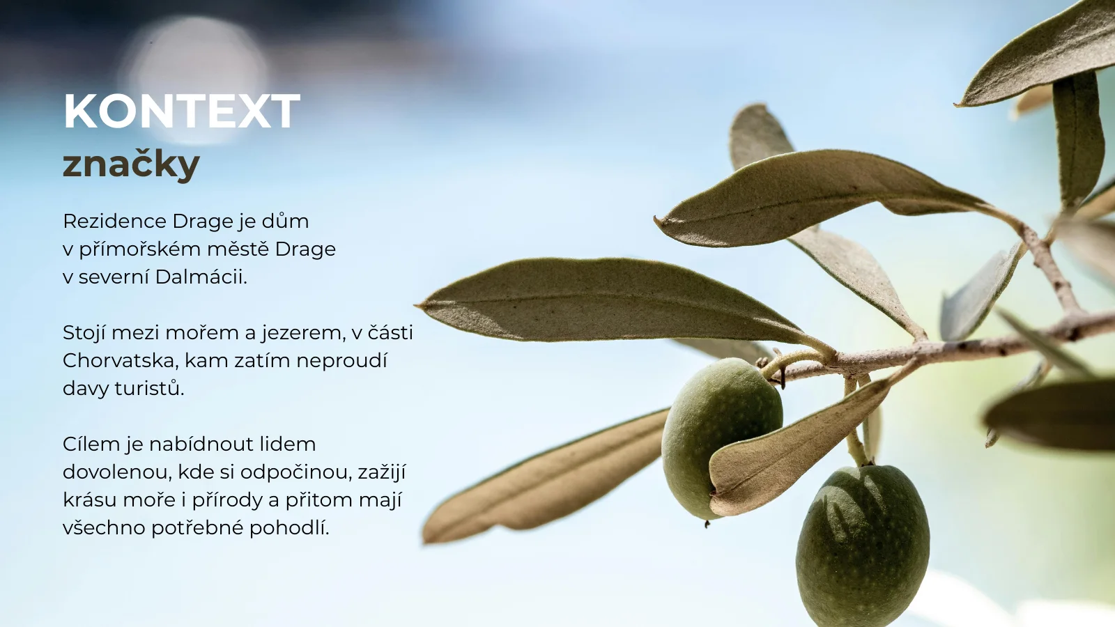
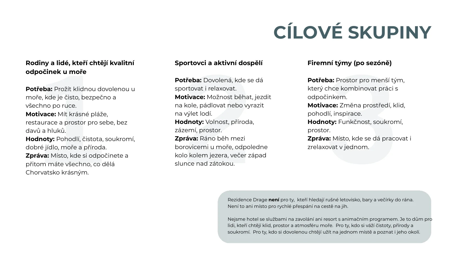
A name that carries
the whole brand direction.
Short, memorable and built on the real story of the house. DVA means two.
The identity carries it on: clean blue, lightness, space and movement. No obvious symbols of sea, sun or holiday clichés.
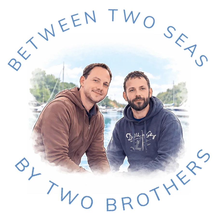
Brothers Jakub and Tomáš. The first reason the house is called DVA.
The brand does not end
with the booking.
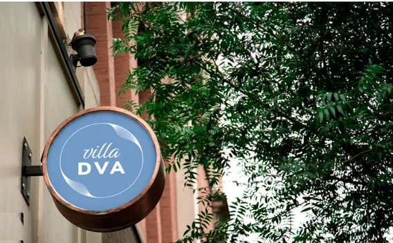
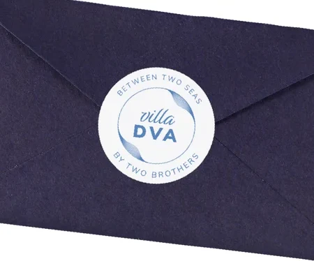
The new direction carries on at the house: on the sign, the welcome card, the guest information and the small details of the stay.
Not so the logo is everywhere. But so everything feels like one whole.
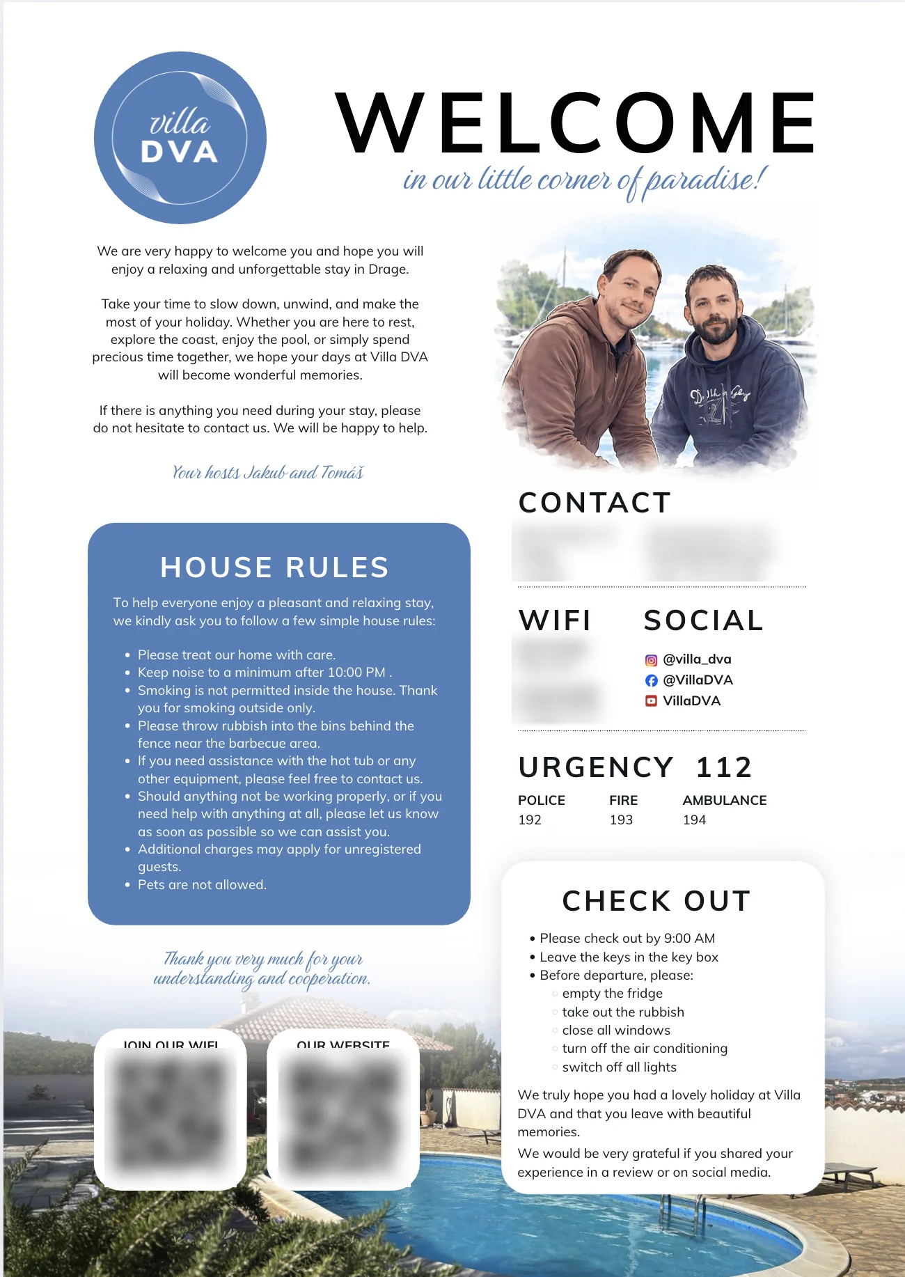
Private details on the card are blurred.

Clean,
but not sterile.
The website had to feel high quality and calm, but not like another anonymous villa.
The home page keeps space and simplicity. The subpages add more of a travel and active rhythm, because the reason to stay is not just the house, but also what surrounds it.
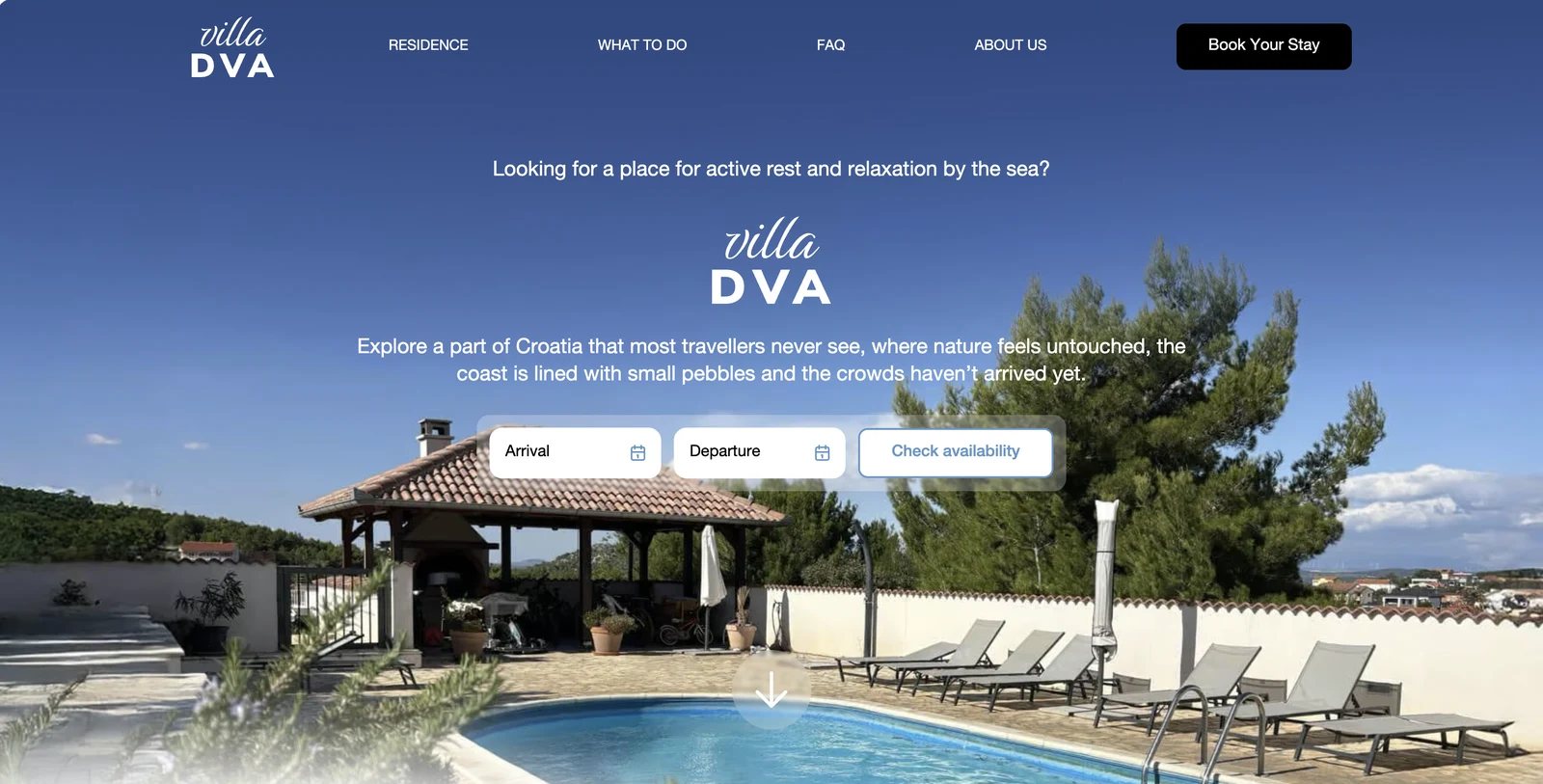
Do not sell just the house.
Sell the reason to come.
The content does not rest on rooms and the pool. It shows the place, the area, activities, local tips and the many ways to spend time here.
So Villa DVA does not talk only about a summer stay, but about a wider reason to come.
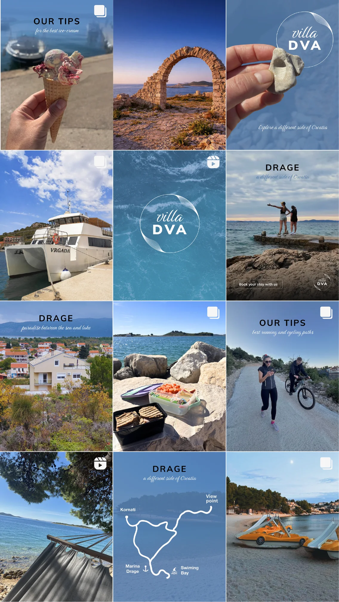
One change
became a whole brand.
It was meant to be a new direction for the website. In the end everything changed: what comes before the website and what follows it.
Sometimes you need more
than a new website
Sometimes the problem starts one step earlier: in the brand, the offer or the way you talk about it.

for what's next.